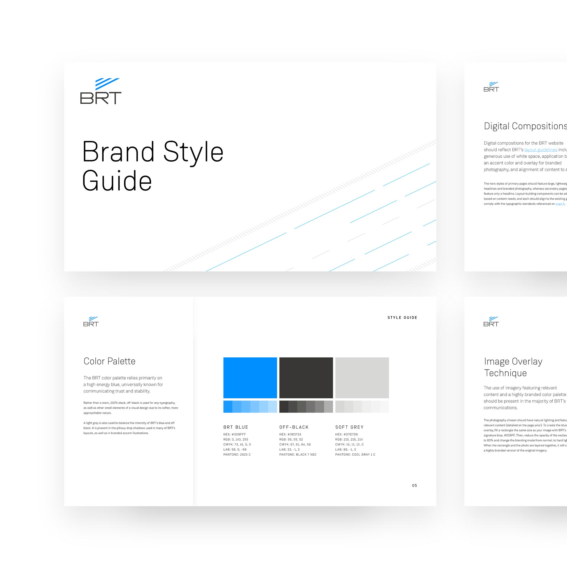
TRBL delivered BRT a Brand Style Guide following a full redesign of their website.
Throughout the website redesign, typography, color, and brand elements were thoroughly explored and finessed. Approaching the BRT brand through the lens of the web delivered an informed, modern, effective, and applicable set of digital-first tactics that BRT uses to shape and inform the entirety of their communication—both digitally and traditionally.
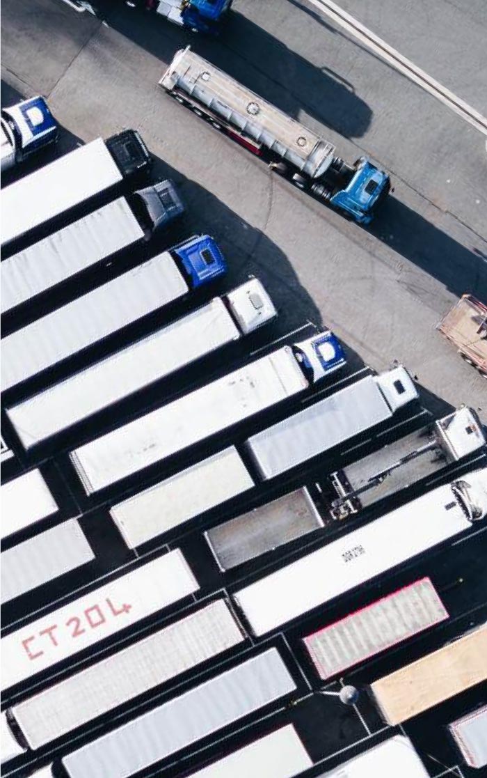
#008FFF
60% Opacity
Hard Light
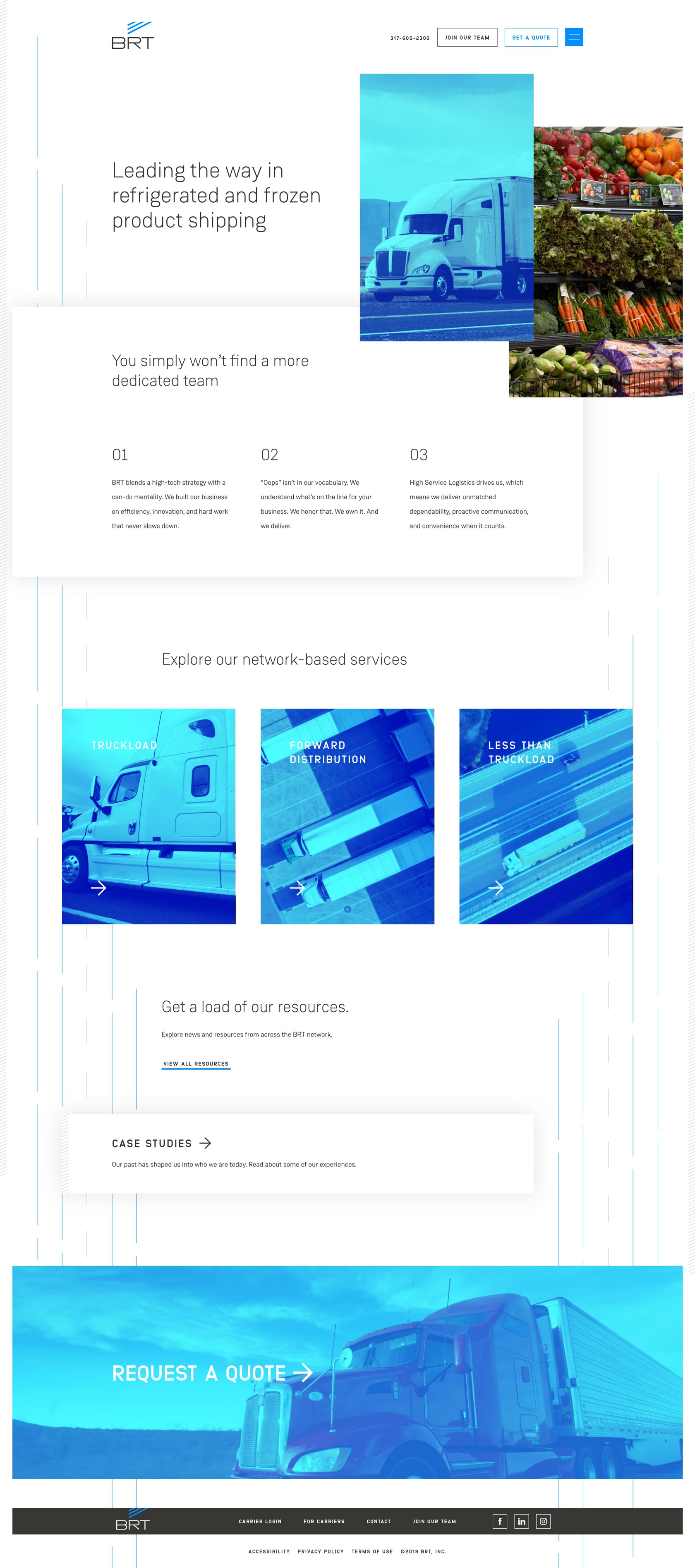
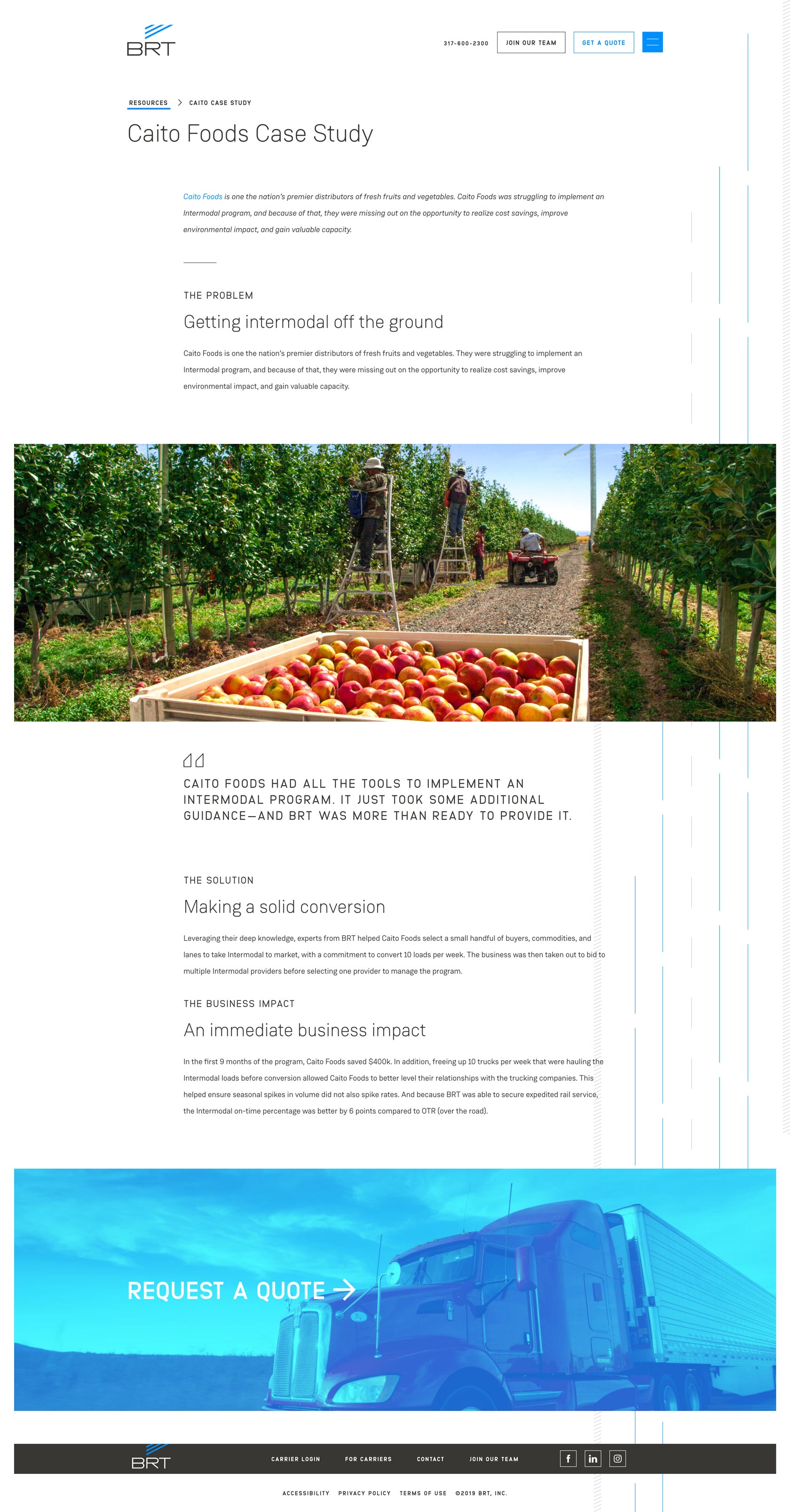
A freezing color palette conveys BRT's temperature-controlled focus.
A deliberate photography treatment style helps connect the color palette to brand photography in an engaging way, and guidelines demonstrate how the lines and angle of the logo should be duplicated within photography wherever possible.
The brand features a graphical pattern modeled after the freight that BRT expertly handles across the expressways of the USA.
On the live website, we implemented a subtle parallax effect that moves the blue freight lines independently from the medians and shoulders of the road. The WordPress headless CMS delivers full control over when and where the road lines are placed - where they are located, when they start, where they end, and more. This makes sure that each page is a dynamic, designed experience and the road lines don't become repetitive as you navigate through the site.
Also, for you grid fans out there, the lines are spaced perfectly—each aligning to one column wide—making for a pixel-perfect experience where the miscellaneous content elements throughout the site align perfectly to a line in the road.


Having designed the BRT brand through a digital—first mentality, its application on the web was seamless.
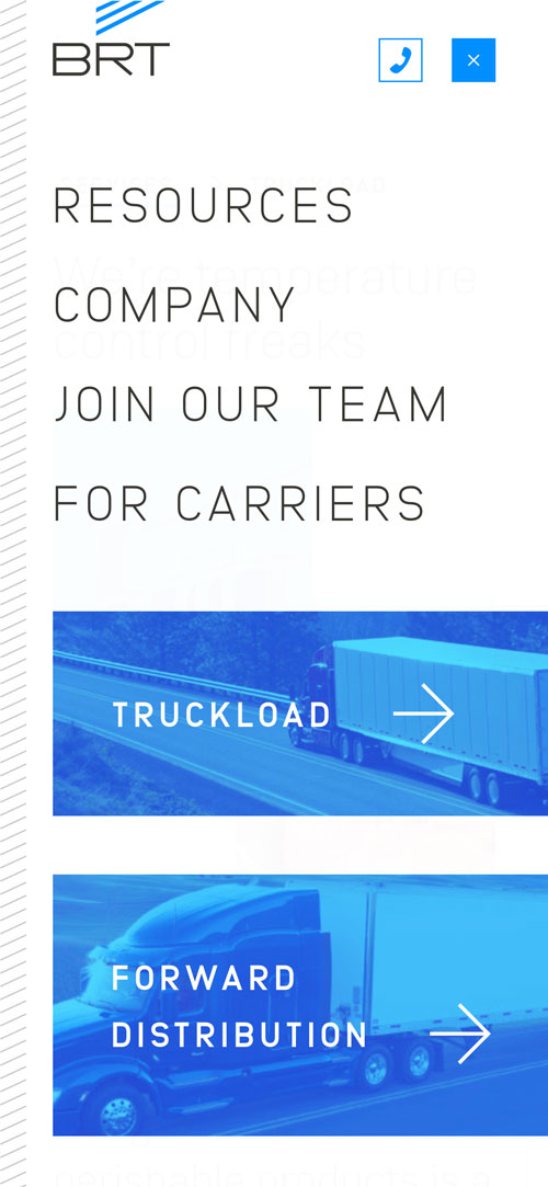
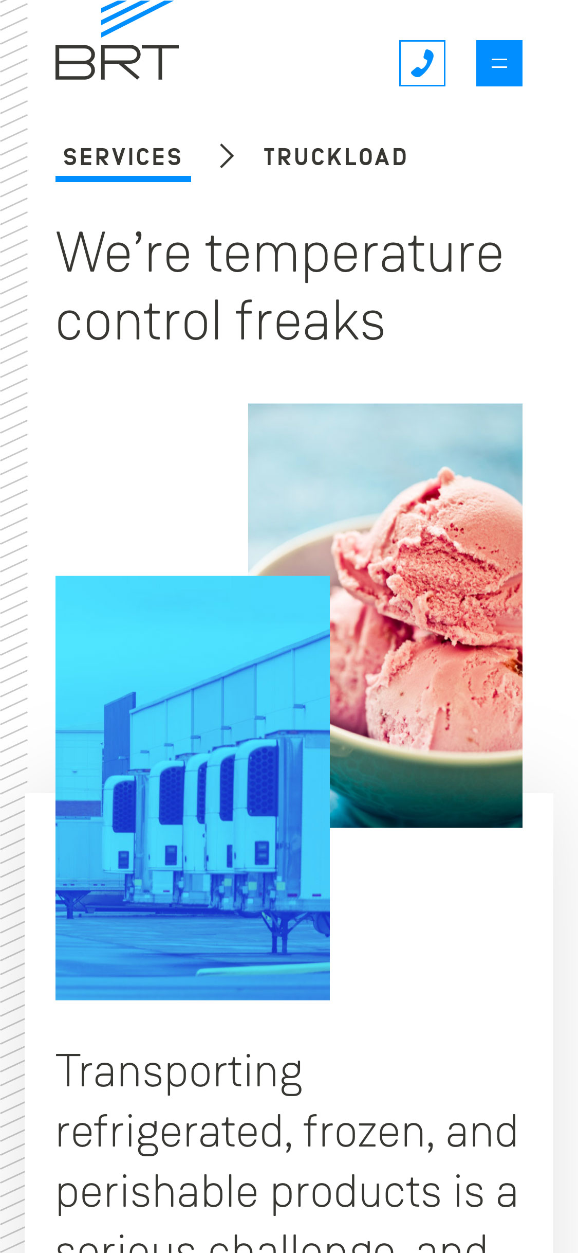
Both desktop and mobile responsive versions of the site serve relevant content concisely to the site's primary audiences. Breadcrumbs are used to make sure that after a few pages are navigated through, the user never loses their way.